Things I’ve learned as a UX Designer
-
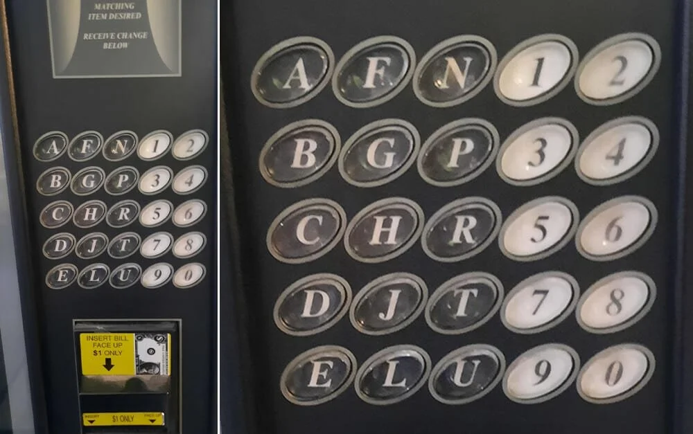
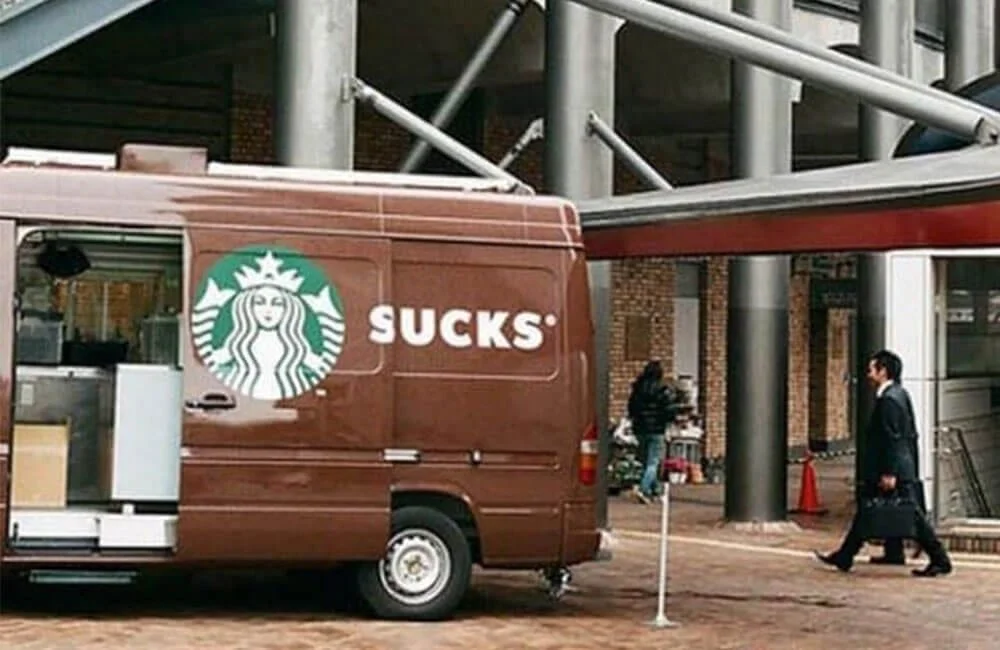
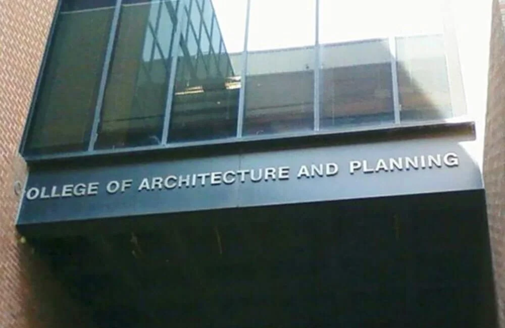
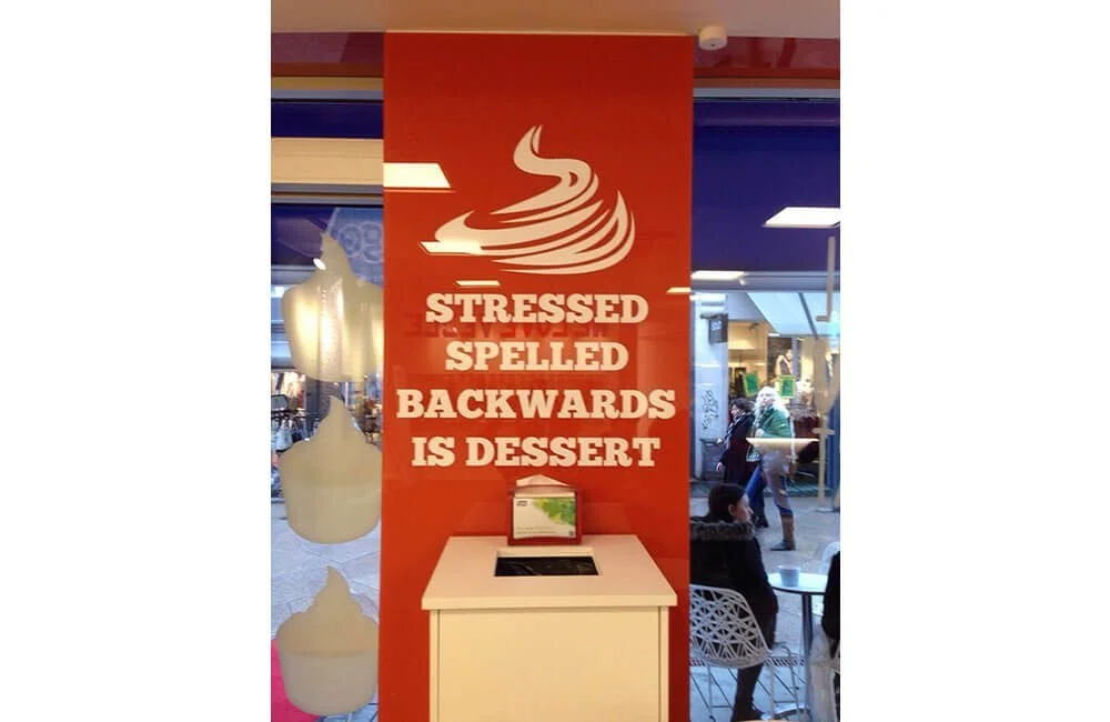
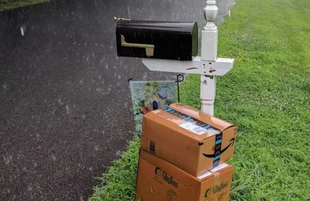
Content location is important
“A clear visual hierarchy guides the eye to the most important elements on the page.
-
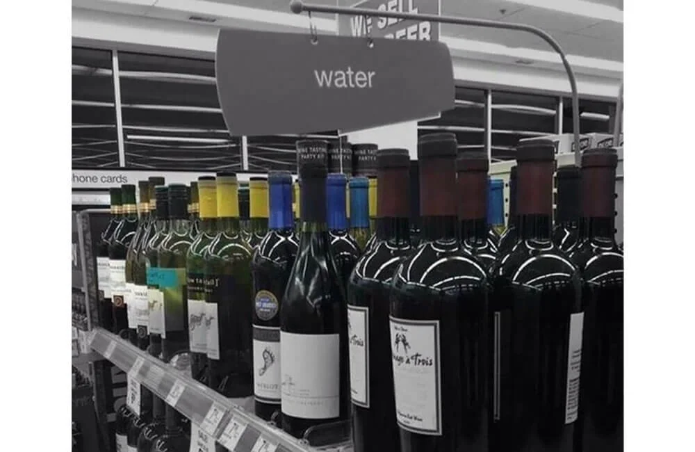
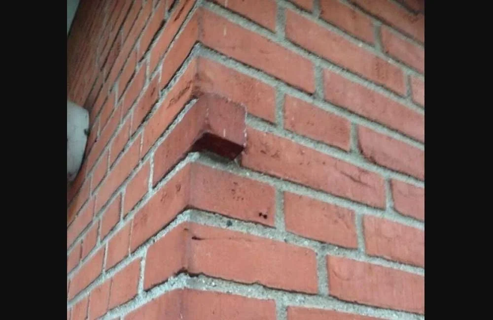
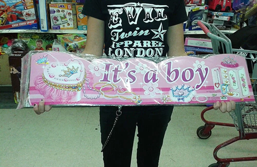
Group similar items
It all begins with an idea. Maybe you want to launch a business. Maybe you want to turn a hobby into something more. Or maybe you have a creative project to share with the world. Whatever it is, the way you tell your story online can make all the difference.
-
UX Debt - Don't fix a problem later
It all begins with an idea. Maybe you want to launch a business. Maybe you want to turn a hobby into something more. Or maybe you have a creative project to share with the world. Whatever it is, the way you tell your story online can make all the difference.
-
Don't skip user research
Description goes here -

Test prototypes before you build it
Description goes here -
Don't just add new features anywhere
Description goes here -

Accessibility is important
Description goes here -

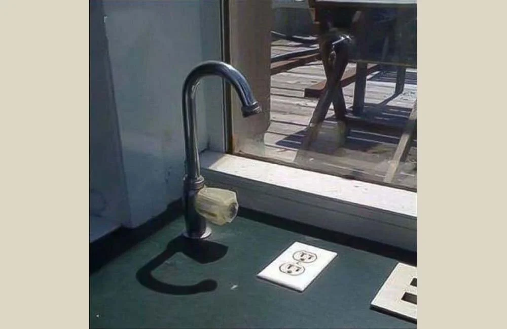
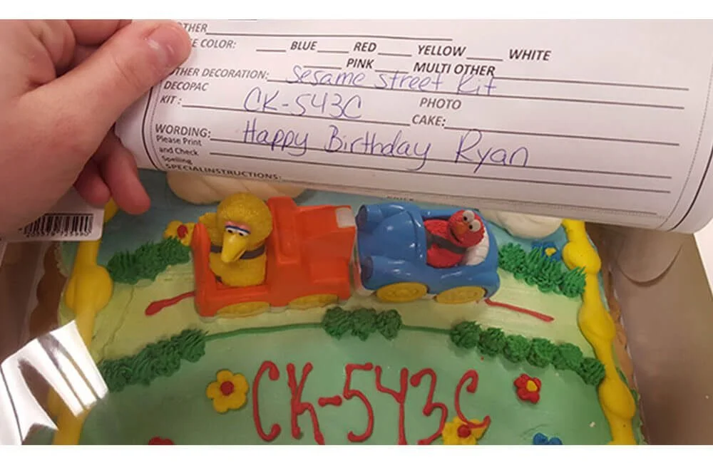
Does your design element have a useful purpose?
Description goes here -
Leave designing to designers
Description goes here -
Disregard for security places users at risk
Description goes here -

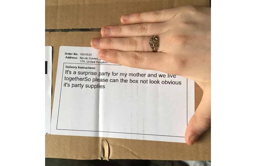
Know what you are talking about
Description goes here -
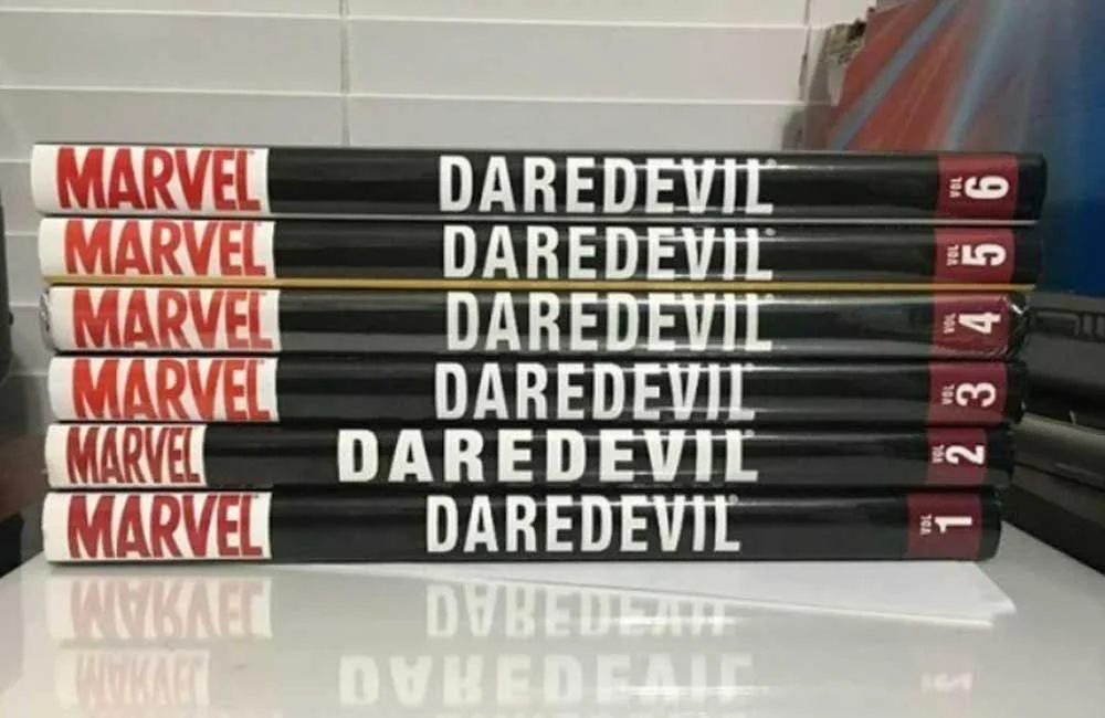
Stick to a design system
Description goes here -
Pay attention to what users do, not what they say
Description goes here -
Accessibility should be tested
Description goes here -
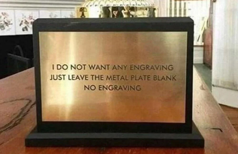
Question rules that don't make sense
Description goes here -
Show, don't tell.
Description goes here -
Consider UX throughout the entire project
Description goes here -
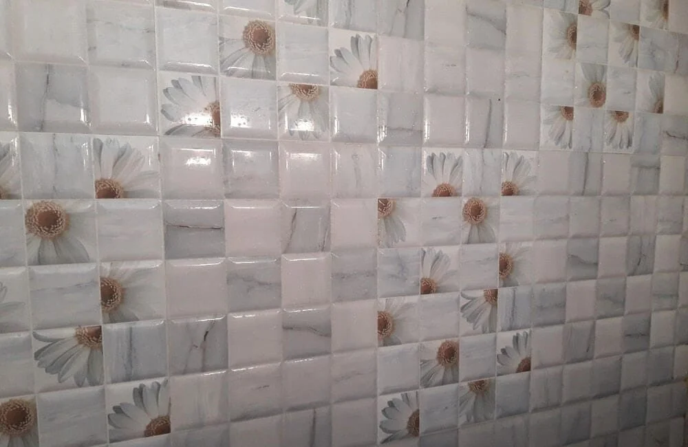
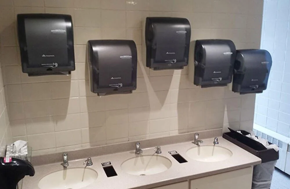
Organize, structure, & label content effectively
Description goes here -
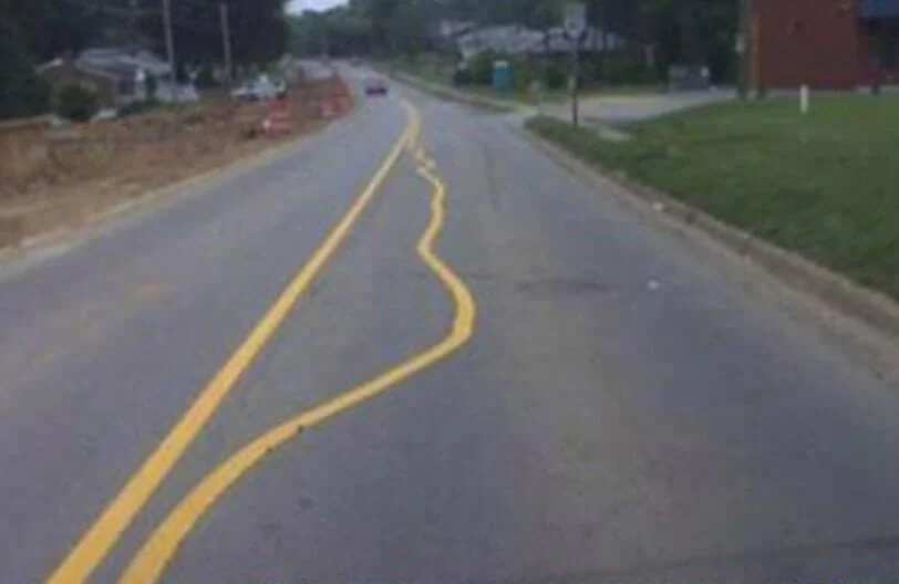
Improper navigation frustrates users
Description goes here -
Creative thinking is not ignoring design systems
Description goes here -

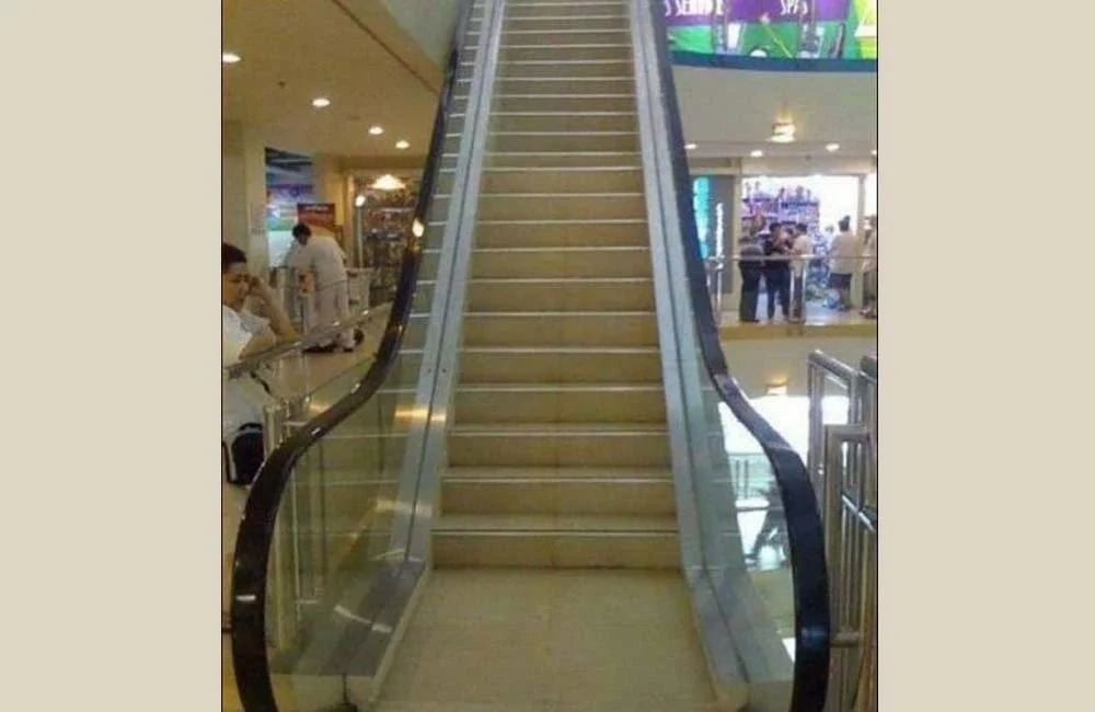
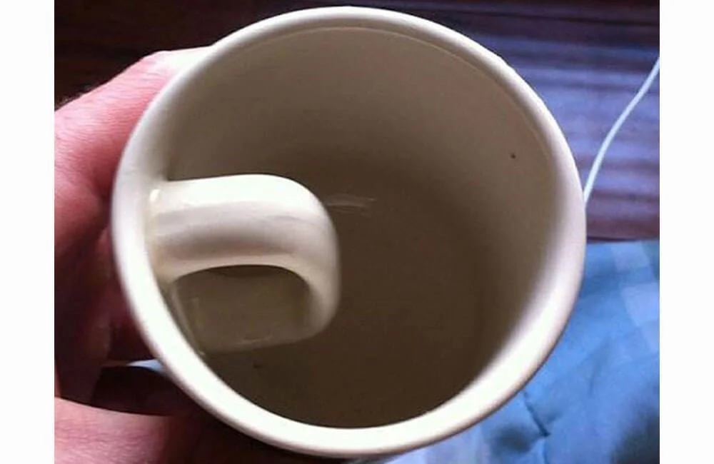
Make it make sense
Description goes here -
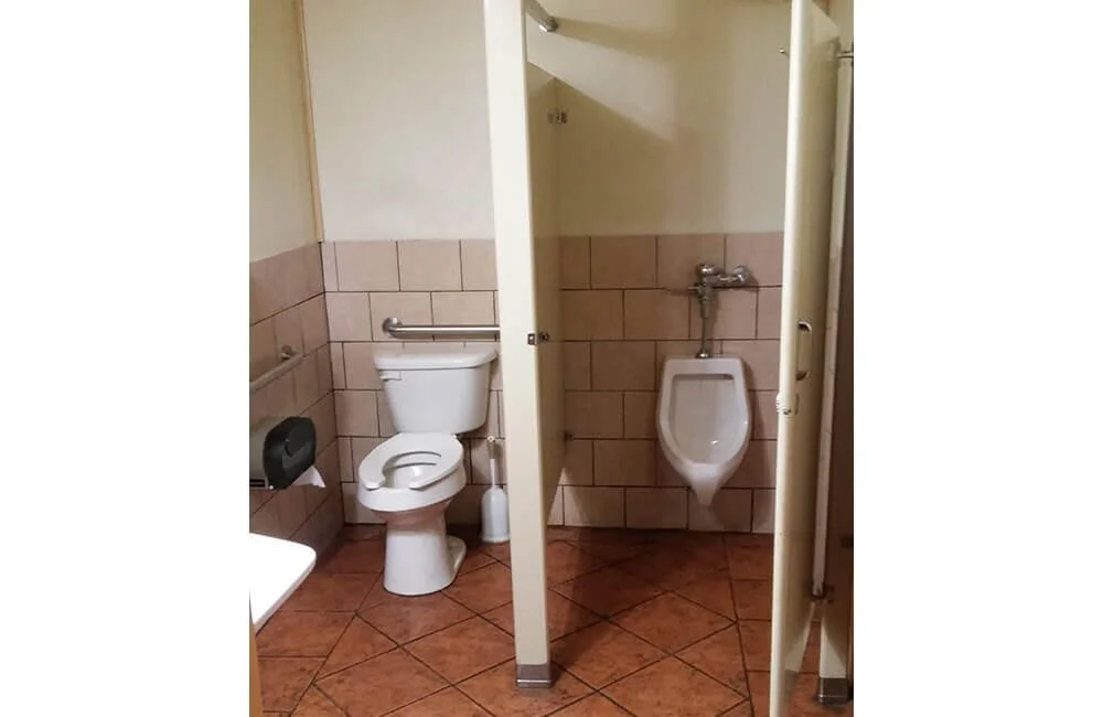
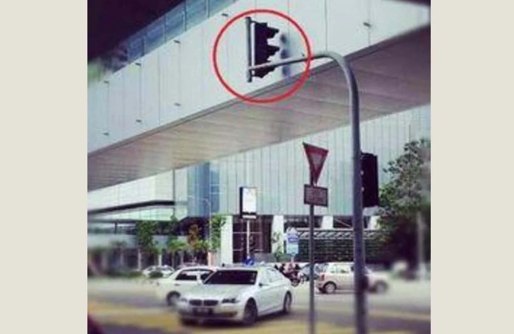
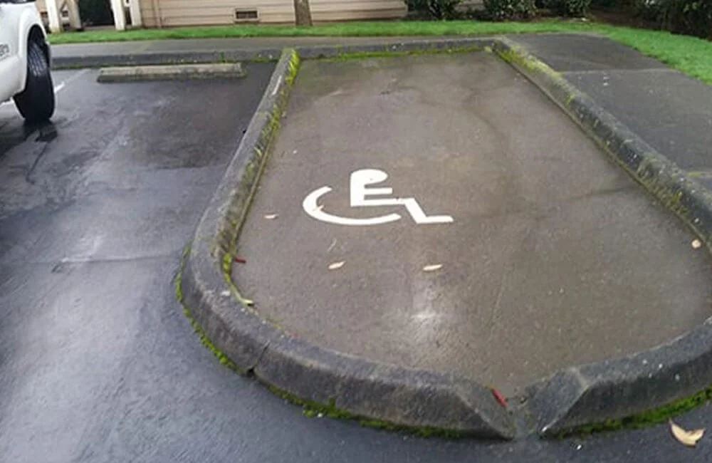
Placement & layout design matter
Description goes here -
Ask probing questions to gather more information
Description goes here -
Meet users needs
Description goes here -
Minimize cognitive overload
Description goes here -

How to tell if your product is working
Description goes here -
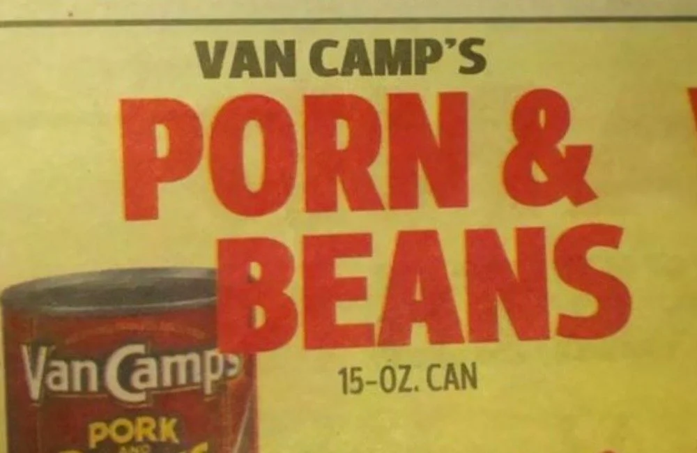
Use spell check!
Description goes here -
Engineer to designer: "I just winged it"
Description goes here -
Follow the design system with exactness
Description goes here -
Always review your designs with other designers
Description goes here -
Everything should have an intuitive place in your design
Description goes here -
Avoid including your own biases
Description goes here -
New List Item
Description goes here -
Too many words could mean a user won't read any at all
Description goes here -
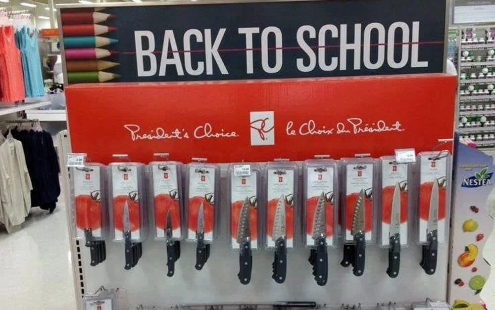
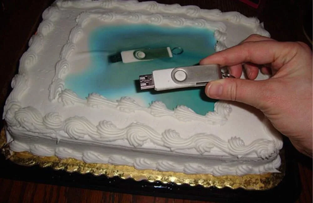
Product misuse may threaten regular users
Antipersonas help anticipate how products can be misused in ways that can harm users and the business.
-
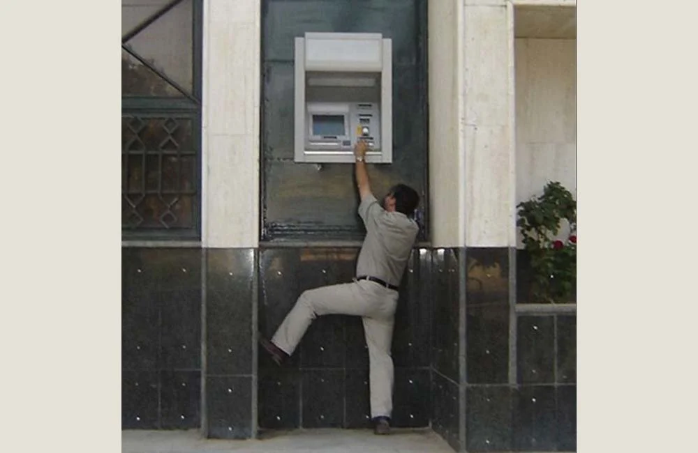
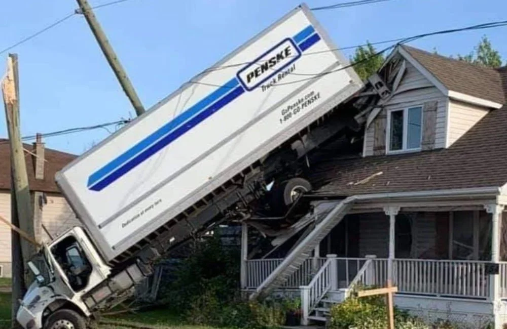
Poor designs can be physically harmful
“As we allow technology to infiltrate every field of our lives, bad UX design could become even more dangerous in the future.”
-
Eliminating design or research isn't a shortcut
Tips to avoid UX design & user research from slipping through your fingers during the compressed timeline of the Agile process.