Internal Desktop App
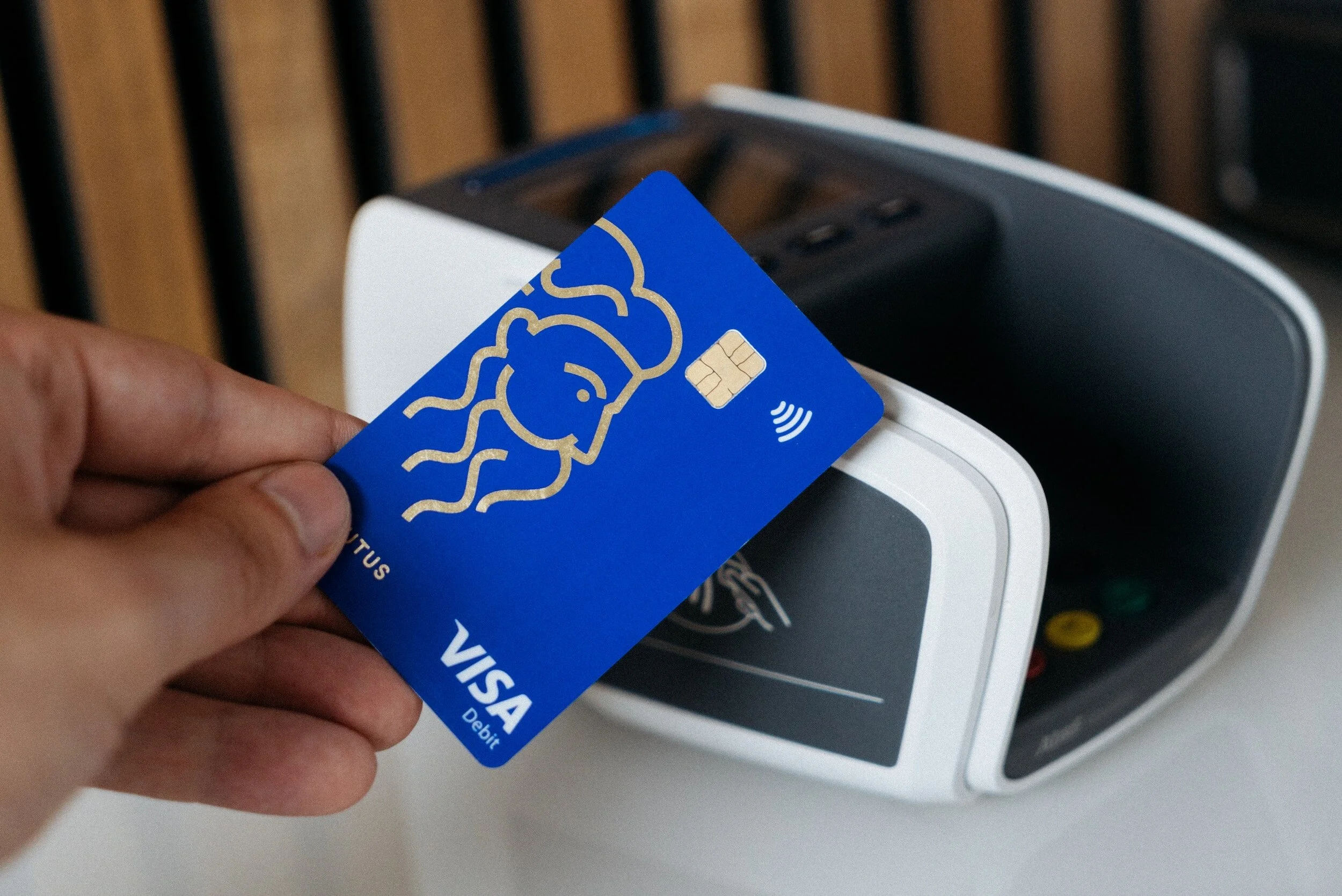
Visa Credit Card Application
-
4 Product Managers
3 UX Designers
1 User Researcher
30+ Developers & QA’s -
Members obtaining credit cards elsewhere because the process was too lengthy
-
Create a digital application comparable in speed to other institutions
-
No design system
No design consistency
User testing on large designs only
Design mockups were only shared every two weeks during a sprint
Developers were just “winging it”
-
The product was delivered on time
The product met it’s goal
Everyone received their bonus’s
I was promoted
-
Build a design system as we go
Designers all adhere to the design system
Create mockups in smaller doses
Usability testing on smaller designs
Manipulate design mockups with PM’s daily (we were 8 mo behind a 12 mo project)
Design review as part of devs definition of done
-
Introduced design system resulting in...
consistency for users + quick processing
faster designs
faster development
system can be used for all internal tools
Keeping original goals & deadlines
-
Design consistency helped users process content faster and across multiple products because they were already familiar with it’s location, function and style
Design consistency gave answers to designers when they were given a new feature to design (no thinking up new design elements for every scenario/task)
Design consistency helped developers reuse design components and maintain consistent spacing (no more winging it)
External Mobile App
Cryptocurrency Within Mobile Banking
-
3 Product Managers
1 Designer & Researcher (me) -
Considering cryptocurrency could be the future of currency, the credit union didn’t have a way for it’s members to engage.
-
Include a cryptocurrency feature within the already existing mobile banking app.
-
Educating users on cryptocurrency
Maintaining trust as cryptocurrency can be risky
Design a feature that doesn’t get lost within the app
We want to target those who would invest their money but legally this is complicated
This vision comes from the new CFO who didn’t stay with the company
-
Introduce the least volatile currencies at first
Cryptocurrency should maintain a similar experience as personal banking because the user is accomplishing a similar task.
-
Define project & scope
User research
User Personas
Competative analysis
Journey maps
Surveys
Solution draft
Userflows
Information Architecture
Sketching
wireframes
lo-fi prototypes
Designs
Hi-fi Mockups
Hi-fi prototypes
Usability Testing
Stakeholders shelved product after CFO left
-
Maintaining similar experience as personal banking
No widget
Simple addition of feature, minimal change for user
Successful architecture because we maintained the familiar design system
Internal Desktop App
I.T. Self-Service, ServiceNow Vendor
-
1 Product Managers
1 Designer & Researcher (me)
6 Developers -
The help Center is congested with help calls. Users should turn to the How-To website for IT self-service.
-
Create a self service site that incorporates a How-To feature so users can easily find answers to issues without calling the help desk.
-
No design system
Already have a how-to site & a separate self-service site.
Even with a self-service resource, users may still call the help desk out of habit
Very short timeframe for design and building application (1-2 mo)
-
Utilize the design and function that already exists in the How-To feature
Incorporate the How-to site into the self-service site
Create searchable help at the top of the application for obvious feature representation
Add other essential actions underneath the main how-to feature.
At the very bottom of the page, will be the help desk number to indicate it is the last option
-
Solidify design system
Where are we pulling the system from
What system would make the most sense?
What design system would create the least amnount of friction for users and developers?
Shadow user’s current experience with the existing software
What is essential?
What would be nice to implement?
What is frustrating?
Why do users fail to access the existing How-to application for answers before calling the help desk?
Mockup drafts to review with users
Usability testing with users
Manipulate designs based off of user feedback
Usability testing with different types of users (managers, loan officers, stakeholders, etc.)
Designer and developers work together for a more efficient production
-
Success was combining the how-to application feature at the top of the self-service website that functioned in the same way as the How-to application.
Users were able to accomplish many different kinds of self-service actions without having to jump to different applications.
-
Creating company wide consistency with design systems
Usability testing
Meeting goals, timelines
Advocating for more testing after the product was built
Episys core platform - Internal Desktop
Symitar Scripts
External Mobile App
Family Search Mobile App
Internal Desktop App
CRM
-
1 Product Manager
1 UX Designer & Researcher (me)
5 devs -
Users are relearning to use scripts because they are not consistent and they do not help the user get the best outcome possible
-
Create a n overall architecture for the scripts to follow that will allow the user to process what they are looking at immediately and what they need to accomplish.
-
Hundreds of scripts
All designed by different developers
No design system
No consistency of design elements
No use of design best practices
-
Designed a script architecture based off of the internal software design system. Each scripts can now be redesigned in it’s own time and follow a consistent pattern no matter the designer or developer.
-
Shadow users
Create a template with IA that matches the design elements of other internal software
Mockup a few designs for popular scripts
Run usability tests
Modify the AI to work as a template based off of user feedback
Continue to move through designing many scripts with the product manager
Review designs with developers
Developers review developed designs with designer for consistency
-
Create a template that will work for all scripts and the design system will align with other internal products.
Create a product that can easily be processed and passed through many devs or designers but stay consistent.
-
Script Template & Design System
-
Family Search is a genealogy resource, an application allowing people to document their family history and link them to their family members.
-
What is it about the mobile application that creates a barrier for users?
-
Keeping research & design mockup to ~2 hours
Users are difficult to schedule because this is an external application
Maintaining consistency in usability questionnaire for validity
Narrowing down usability participants or having to eliminate some diversity because only a few participants were needed.
-
Conduct three usability tests
Feedback suggests the structure doesn’t follow an architecture that was familiar to them
Restructure the information architecture to align with mobile best practices (home page, navigation, etc.)
Clarify verbiage
Eliminate design system inconsistencies
-
Restructuring the information architecture to match best practices in mobile design (home page, chunking like features) will improve user engagement & keep design elements consistent.
-
2 Product Managers
1 UX Designer & Researcher
15 Developers & QA’s -
CRM vendor switch
-
Update CRM
-
No design system
No design consistency
User testing on large designs only
Design mockups were only shared every two weeks during a sprint
Developers were just “winging it”
-
The product was delivered on time
The product met it’s goal
Everyone received their bonus’s
I was promoted
-
Build a design system as we go
Designers all adhere to the design system
Create mockups in smaller doses
Usability testing on smaller designs
Manipulate design mockups with PM’s daily (we were 8 mo behind a 12 mo project)
Design review as part of devs definition of done
-
Introduced design system resulting in...
consistency for users + quick processing
faster designs
faster development
system can be used for all internal tools
Keeping original goals & deadlines
-
Design consistency helped users process content faster and across multiple products because they were already familiar with it’s location, function and style
Design consistency gave answers to designers when they were given a new feature to design (no thinking up new design elements for every scenario/task)
Design consistency helped developers reuse design components and maintain consistent spacing (no more winging it)


